

The digital filing cabinet
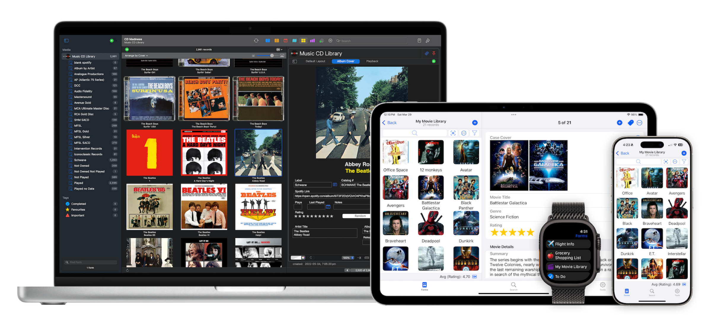
Accounts, projects, expenses, inventory, recipes, and more — organize it all in one place with Tap Forms Pro. The most friendly, accessible, and powerful database app for your Mac, iPad, iPhone, and Apple Watch available today.

What’s new in Tap Forms Pro:

Template Library
Import from an ever growing library of freely available forms

Report Generator
For customizing and generating professional looking reports

Collaborate & Sync
Sync documents via iCloud, Dropbox, WebDAV, and nearby devices

AI Form Generator
Use AI to generate forms and fields just by typing in a form name

New Look and Feel
Enjoy a refreshed visual design and a host of alternate app icons

Apple Silicon
Runs natively on Apple’s M-series CPUs for blazing fast performance

Tags
Organize your records with colourful tags and symbols

Universal Layouts
Design custom layouts for Mac, iPhone, and iPad with effortless drag-and-drop

Cascading Pick Lists
Create Pick Lists that have many levels of values.

Your data on your devices. Privately*
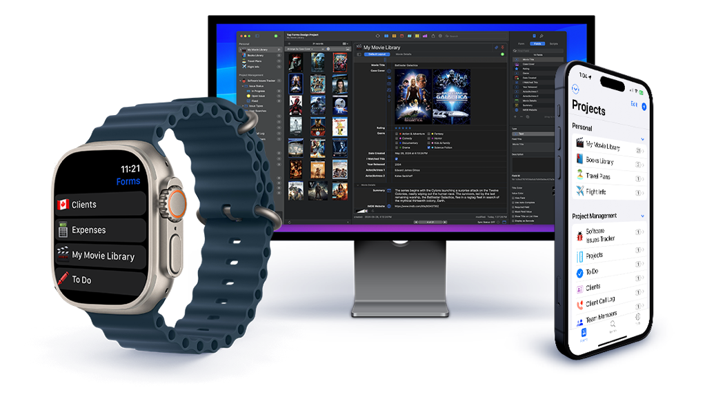
Access your data wherever you are. Whether on your Mac, iPad, iPhone, or even Apple Watch, Tap Forms Pro has you covered. And your data is private. Stored locally on each of your devices. Sync locally or encrypted via iCloud, Dropbox, or WebDAV.
* We do not collect any of your data. Not even app usage activity.
Bento compatible.
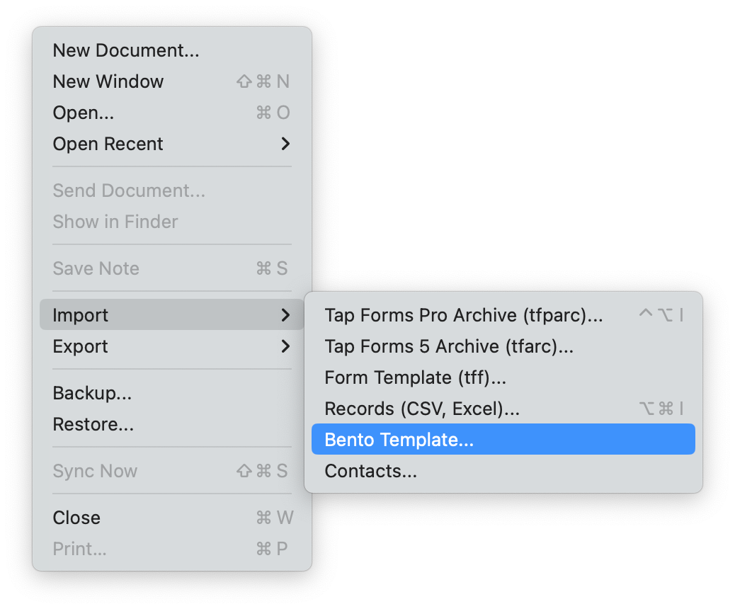
Switching from Bento? You can easily import your existing Bento data into Tap Forms Pro on the Mac with just a few clicks.


Forms designed your way.
Use our built-in design tools to create custom forms, or choose from our selection of ready-to-go templates. Tracking, managing, and maintaining your data has never been easier.


